> For the complete documentation index, see [llms.txt](https://docs.powerfulform.com/llms.txt). Markdown versions of documentation pages are available by appending `.md` to page URLs; this page is available as [Markdown](https://docs.powerfulform.com/quick-start/form-field-types/radio-buttons-field.md).
# Radio buttons field
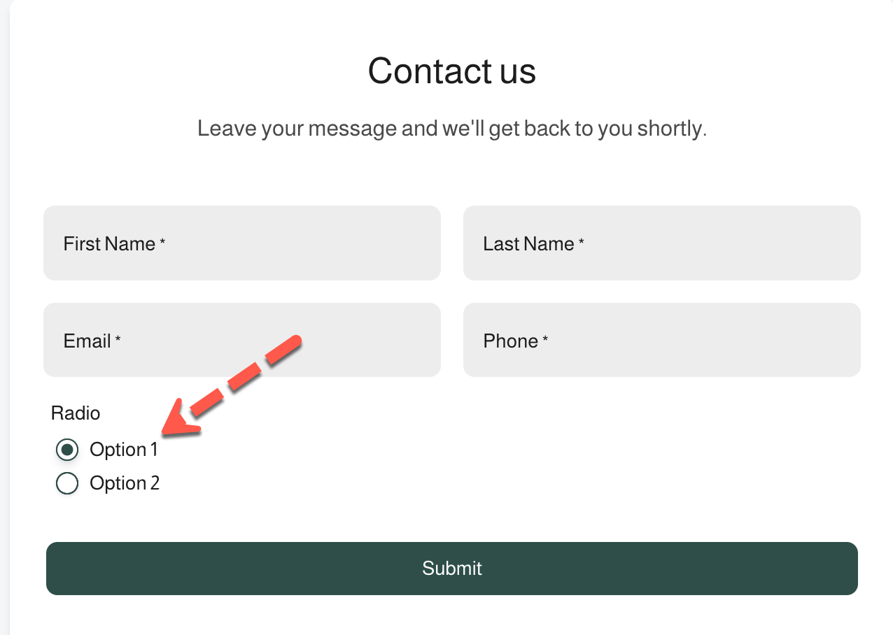
The **Radio buttons** field lets users select one single option from a list.\
All options are visible at once, making it easy for users to choose quickly.
***
### ✅ When to use Radio buttons
Use the Radio buttons field when:
* Only one option should be selected
* You have a small number of options (usually 2–5)
* You want all choices to be visible without clicking
**Common examples**
* Yes / No questions
* Contact preference
* Account type
* Delivery method
***
### ⚙️ How it works
1. Users see all available options
2. They select **one option**
3. Selecting a new option automatically deselects the previous one
4. The selected value is saved with the submission
***
### 🧩 How to add a Radio buttons field
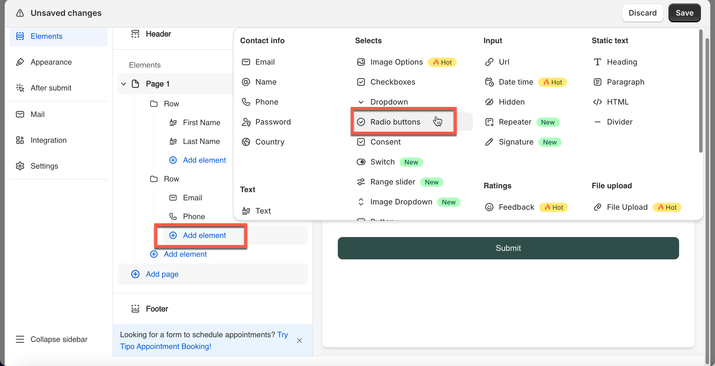
1. Open your form in the editor
2. Click **Add element**
3. Select **Radio buttons**
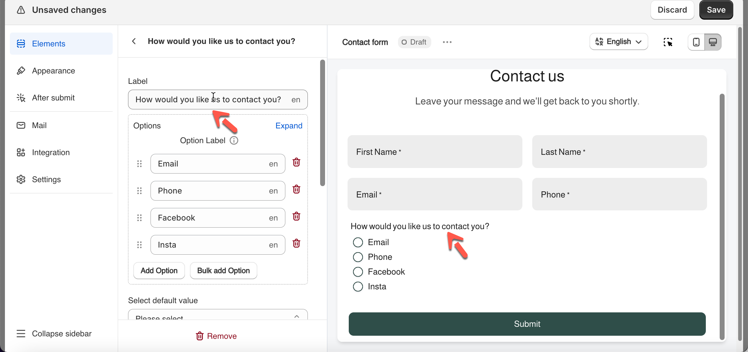
4. Add your option labels
5. Configure other detail of the field
6. Click **Save**
***
### 🛠️ Field settings
#### Placeholder text
Radio buttons do not use placeholder text.\
Instead, use a clear field label or description to explain what users should choose.
Label examples
* `How would you like us to contact you?`
* `Select your account type`
***
#### Default value (optional)
The default value lets you pre-select one option when the form loads.
Use a default value when:
* One option is the most common
* You want to guide users toward a recommended choice
**Examples**
* Default option: `Email`
* Default option: `Standard support`
⚠️ **Tip:** Avoid setting a default if the choice must be intentional.
***
#### ✅ Required field (recommended)
When enabled, users **must select one option** before submitting the form.
**Common use cases**
* Inquiry type
* Contact preference
* Service level
**Example**
* Users must choose either `Personal` or `Business`
***
#### Other option (optional)
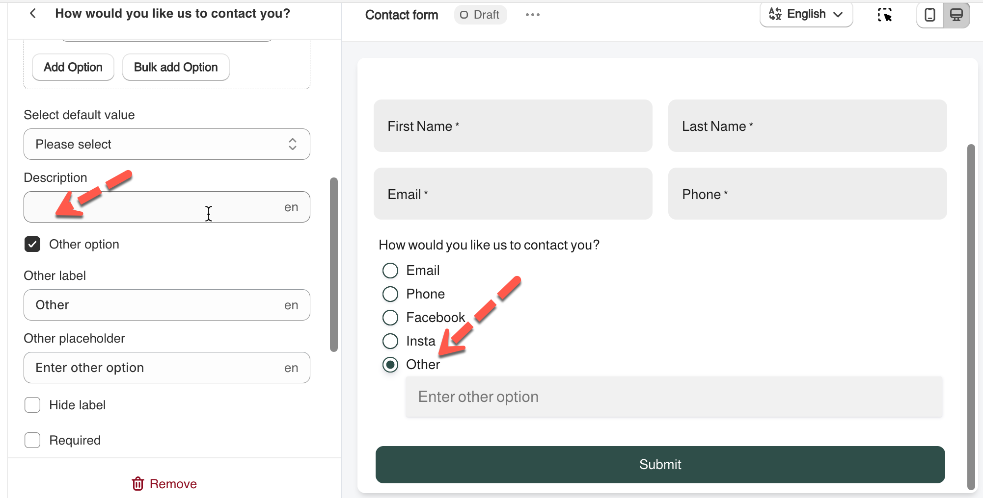
The **Other option** allows users to select **“Other”** and enter a custom value.
When enabled:
* An **Other** radio option appears
* Selecting it reveals a text input
**Example**
* Options: `Email`, `Phone`, `Live chat`, `Other`
* User selects **Other**
* User enters: `WhatsApp`
**Tip:** Always add a clear placeholder like `Please specify`.
***
#### 📐 Layout options
You can control how radio buttons appear in your form:
* **Number of options per line**\
Display options in 1 or multiple columns
* **Column width**\
Adjust how wide the field is (33%, 50%, or 100%)
Use these settings to match your store’s layout.
***
### 🌟Best practices
* Use **Radio** **buttons** instead of **Dropdown** for short lists
* Keep option labels short and clear
* Order options logically (most common first)
* Avoid using **Radio** **buttons** for long lists
***
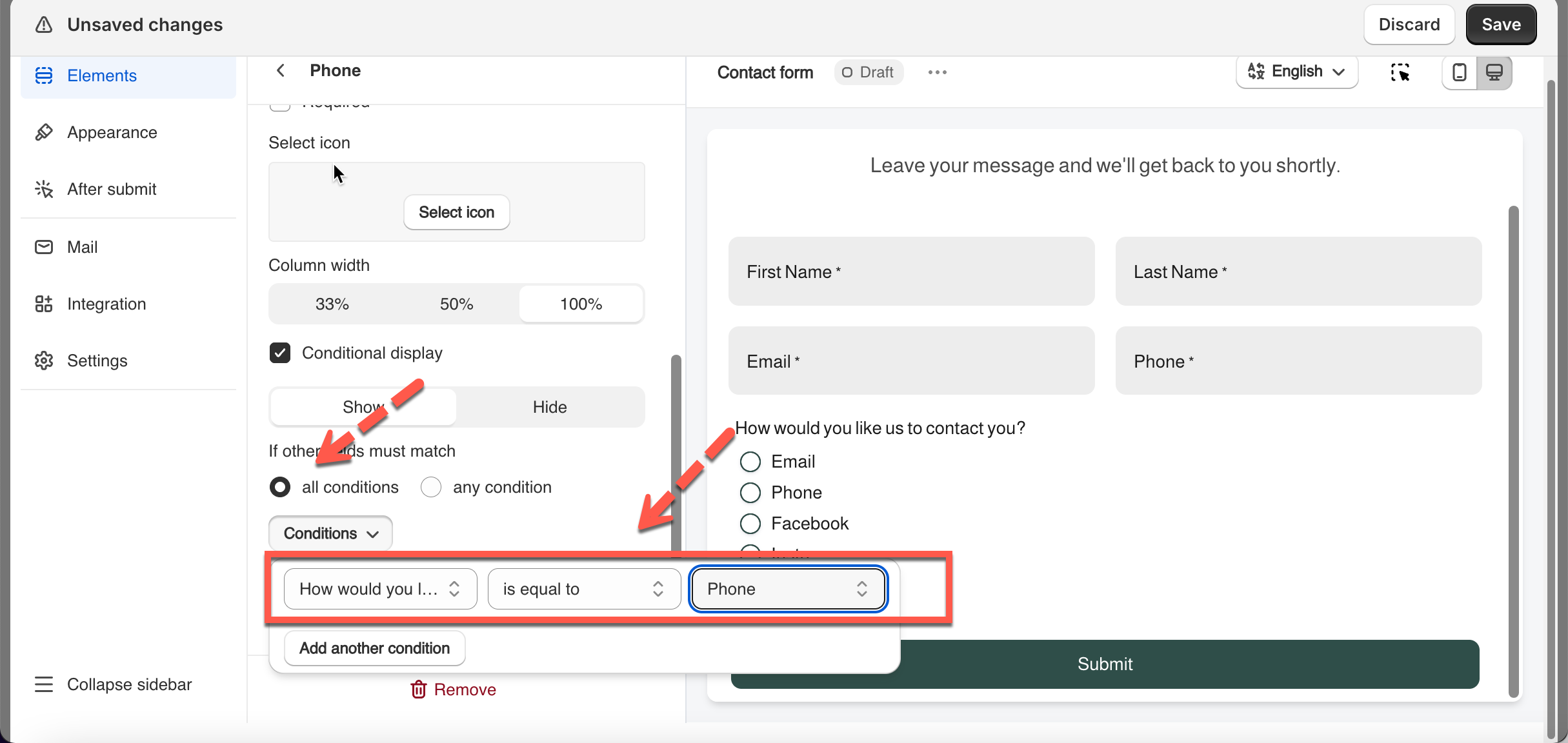
### 🔀 Use Radio buttons with conditional logic
Radio buttons work perfectly with conditional display.
**Example**
If customers select option **Phone**, the **phone** field shows up.
***
#### Need More Help?
If you still need assistance, please contact us at . Our team will be happy to help you resolve any issues or guide you further.